5 paywall examples to inspire your monetization strategy
Last updated: March 12, 2024

With ad revenue slowing down and programmatic revenue set to plummet in 2024, subscriptions are becoming more important than ever. More publishers are investing in subscription and membership in 2023, with the majority of those surveyed (80%) saying this will be one of their most important revenue priorities, ahead of both display and native advertising, according to a study by The Reuters Institute and The University of Oxford.
That means your paywalls (also called meters) will make or break your media business. But putting up a paywall isn’t as easy as blocking off some articles and creating a payment form.
The success of your paywall comes down to a lot of factors: its copy, design, display frequency, formatting (does it take up the full screen, display within the article, or on the footer?), the amount of “free” articles offered, the strength of subsequent landing pages, etc.
Master subscription models: 9 Proven tactics to skyrocket retention & revenue:
Whiffing in any of these areas drives potential subscribers away and stands in the way of sustainable revenue. So in this post, we’re looking to legacy media and leading magazines for examples of successful paywalls and breaking down why each one works so well. So you can walk away with examples to inspire your monetization strategy — and drive more revenue from your content.
5 paywall examples to inspire your monetization strategy
The Guardian
Our first paywall example isn’t technically a paywall. Instead, it’s the Guardian’s appeal for reader donations. While it’s not technically promoting subscriptions, The Guardian’s mission-driven approach and flexible payment methods provide great inspiration for any media brand looking to drive growth. Here’s why it works:
Provide open access: As part of its commitment to accessible journalism, The Guardian doesn’t gate articles. Instead, its “paywall” appears as a footer covering the bottom ¼ of the homepage and other articles. This open approach allows readers to experience The Guardian’s reporting for themselves before deciding whether to commit, which is especially important for a donation-driven publication.

Create a common enemy: This appeal asks for contributions by emphasizing The Guardian’s truly one-of-a-kind value proposition as the world’s most credible source of independent journalism. This works so well because it speaks to their audience’s concerns about political uncertainty and presents their journalism as a solution. They mention a common enemy and position themselves as an ally in the fight against biased journalism.
Including a donation tracker drives this point home further. Rather than funding a publication, it feels almost like a GoFundMe contributing to a cause (which is exactly what The Guardian is going for here.)
Offer multiple payment options. They understand that not everyone can afford the price of a standard news subscription. Rather than turn these interested readers away, they offer reduced donation options (including the open-ended “other” choice). They also offer one-time or recurring donation options, which allows readers to give on their own terms.
Redirect to a well-designed landing page listing subscriber-exclusive benefits. Here, readers can choose their donation option and see what perks they receive with each one. That’s especially important for an open access publication like The Guardian, where the benefits of a paid donation aren’t immediately obvious. But toggling through these options reveals that annual contributors get access to exclusive newsletters. Monthly contributors receive that as well as an exclusive mobile app and ad-free reading.
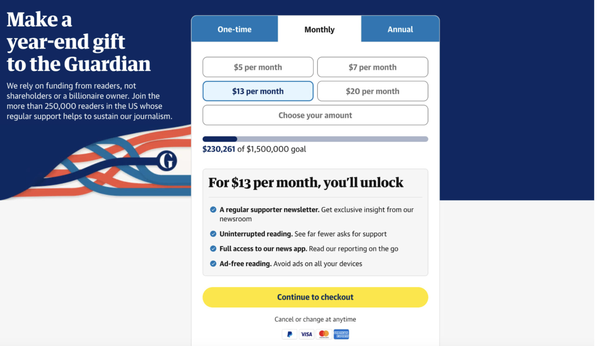
Provide social proof: By saying “Join the more than 250,000 readers in the US whose regular support helps to sustain our journalism,” they’re telling potential contributors, “A lot of other people trust us with their donations. You can too.” That alone can convince on-the-fence audiences to commit.
Taken together, this gives interested parties the reassurance and motivation they need to donate.
The Atlantic
Give readers a sneak peek: The Atlantic’s paywall displays upon scrolling past two paragraphs. This allows readers to sample some of The Atlantic’s content without giving them full access. If you’re struggling to balance traffic and subscription revenue, this could be a nice compromise for your business as well.
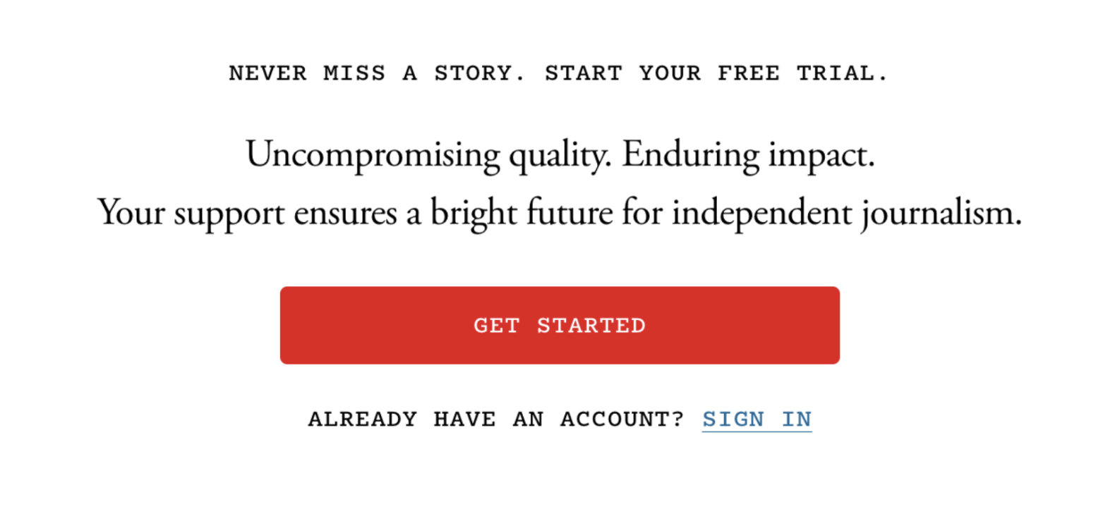
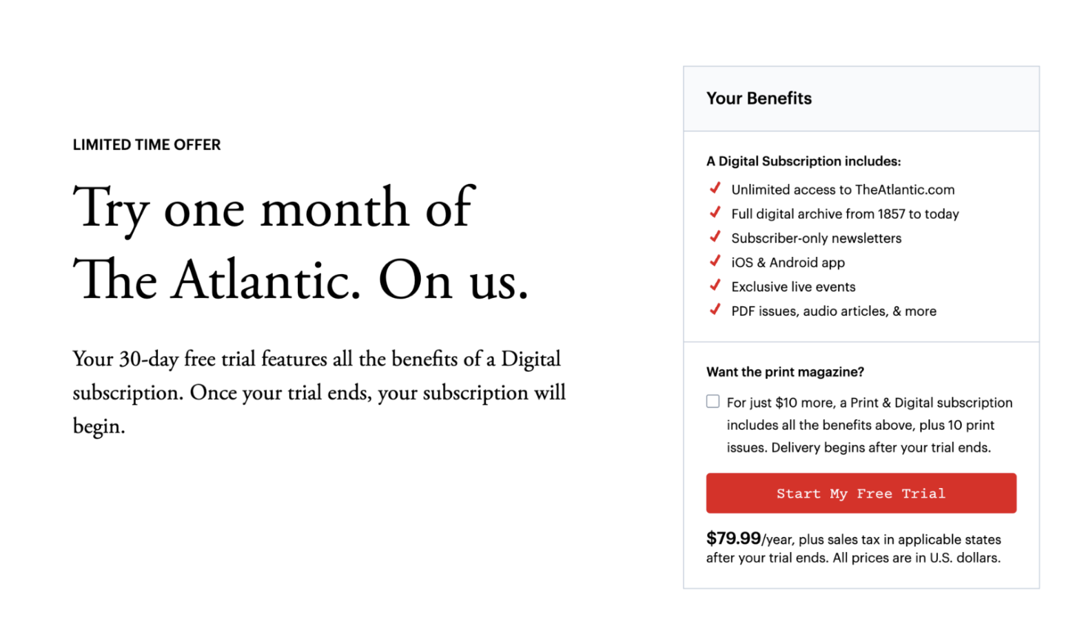
Consider offering a free trial. After decades without paying for digital content, many potential subscribers will be reluctant to shell out for a subscription. The Atlantic combats this by offering one month free.
Below this appeal, they stress the value of their paid subscription by mentioning all the subscriber-only perks like exclusive newsletter, the mobile app and events. This reassures reluctant readers that they’ll get value that goes beyond reading a few articles — instead, they’ll be able to experience the best of The Atlantic brand on multiple formats, on their own terms.
Clearly state auto-renewal terms. After clicking Start My Free Trial, users proceed to a checkout page. Here, The Atlantic makes their auto-renewal terms super clear by placing them in a brightly colored box located just above the confirm button. This makes the process more transparent and reassures readers they’re making the right decision.

Vanity Fair
Vanity Fair’s paywall displays along the bottom quarter of the page after someone has read one article.

This paywall succeeds on a few levels. First, the header doesn’t just tell the reader that they can’t read any more articles — pay for a subscription or get out. Instead, they say “Another round?” Rather than forbidding the user from engaging, this phrasing invites the reader to learn more about the subscription in a way that feels very Vanity Fair.
Also, the bright red button draws the readers’ eye right to the CTA, making it more likely someone will click through and learn more.
Allow readers to choose between multiple bundle types. This proceeds to a landing page where readers can choose between an all-access subscription to several Conde Nast brands, along with other perks like complementary recipes and free merch, or the standalone Vanity Fair subscription.
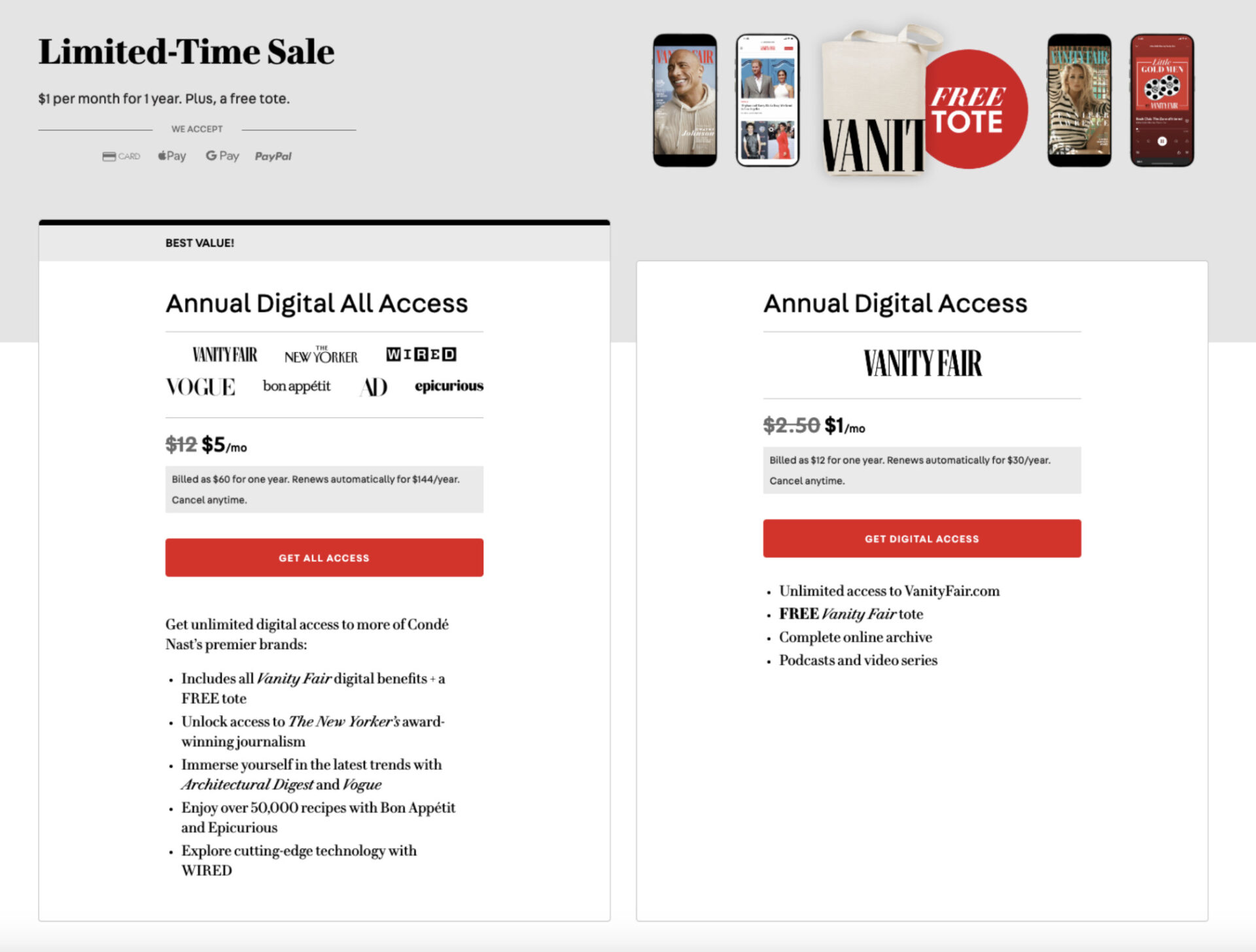
Once again, the page’s design — white background with simple monochrome images and a column layout — draws readers directly to those bright red CTA buttons, reducing the chances that they get distracted and click out.
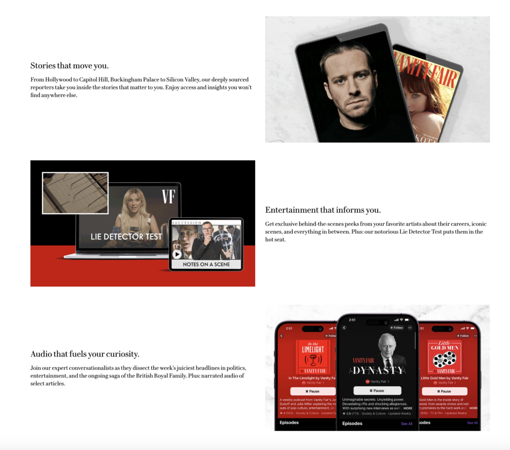
Counter pre-purchase objections by reminding readers of their value. Under these columns are additional content blocks promoting the best of Vanity Fair, including its expert reporting, Lie Detector Test and audio options. So if someone’s unconvinced after reading through the subscription package options above, this reminds readers why they were interested in subscribing to begin with — and serves as a nice final sales pitch.
Bloomberg Media
Bloomberg’s paywall displays on the bottom one-third of the page on the first article.
Keep non-subscribers engaged with a registration wall. Bloomberg understands that not everyone in their audience is willing to pay for a subscription right away. Other publications might be fine letting those people go. But Bloomberg lets readers choose between a free registration or a paid subscription.
So even if someone’s reluctant to pay at first, Bloomberg can still collect data on their reading habits and personalize content and offers to them. From there, they can progressively improve each user’s experience (and drive them closer to an eventual subscription).
This paywall also provides an option to subscribe. Note the white CTA button here. Since it contrasts the black background so strongly, it attracts the reader to the paid subscription package and encourages them to explore that option further.

The Wall Street Journal
Spark a sense of urgency. The WSJ’s paywall displays in the middle of the page on the first article, as shown below. Most notably, its “Cyber Week Offer” answers the question, “Why should I subscribe now?” This interrupts your audience’s complacency and drives action.

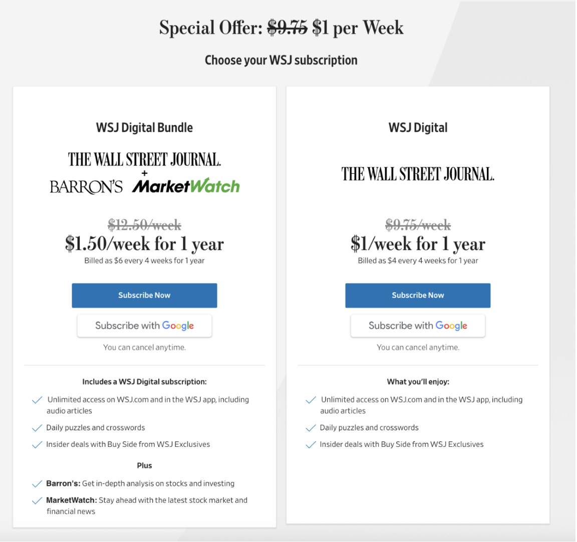
List subscriber-exclusive perks. The paywall proceeds to a landing page where, similar to Vanity Fair, readers can subscribe to a bundle of WSJ brands or the standalone WSJ publication. Each of these options lists subscriber-exclusive options and uses minimalist design to keep the audience’s focus on the offer at hand.
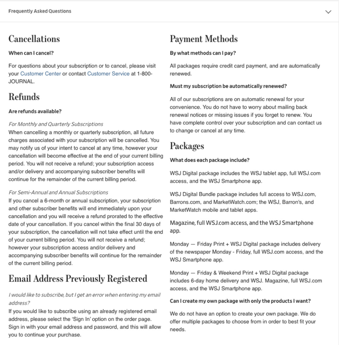
Combat pre-purchase uncertainty and increase conversions with an on-page FAQ. A menu below the subscription package options includes an FAQ covering cancellation, payment methods and refunds. So if someone’s concerned about not being able to cancel their subscription, they can scroll down to see what the process looks like and decide for themselves, rather than navigating away from the page to find out… and forgetting to come back.
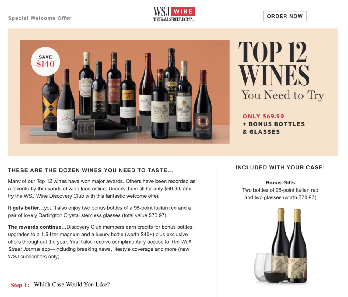
Sweeten the pot with a special welcome offer. This menu also links to other corporate and gift subscription packages, as well as a special welcome offer for the WSJ Wine Club, which gives new subscribers steeply discounted wine delivery. This offer works because a) it’s very aligned with the WSJ’s audience of sophisticated, well-educated professionals and b) it gives the audience something tangible in addition to the digital content they’ll get through the website and app (and who doesn’t love a special delivery?).
Subscribe to our newsletter
Sign up to get our latest articles sent directly to your inbox.
What you should do now
- Schedule a Demo to see how Omeda can help your team.
- Read more Marketing Technology articles in our blog.
- If you know someone who’d enjoy this article, share it with them via Facebook, Twitter, LinkedIn, or email.